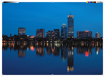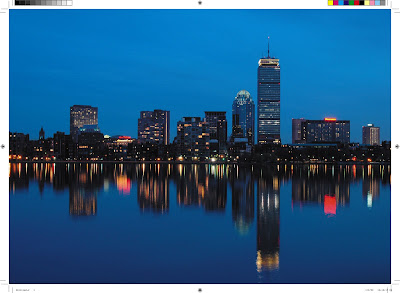
Printer's Marks (crop marks, gradient tint bar, registration marks, progressive color bar, etc.) can all be summed up with one word... unnecessary. There's a reason why they're called PRINTER'S marks. Press operators need them to register colors, check color balance, and trim the final product. However, the printer's marks that a designer provides in their file are rarely used. In fact, pre-press technicians often have to go to some effort to remove or work around the provided printer's marks and setup their own. In other words, they're a nuisance.
There are two types of designers who place all of these wonderful obstacles around their artwork: inexperienced designers who really have no idea what these really do, but think they are needed for some reason, and design agencies who have been doing it since the film and paste up days and think that they give the client that warm fuzzy feeling that says, "Wow, these guys really know what they're doing."
Who are the color and gradient bars for? No one. Almost everyone is moving away from film. And IF printers need them for electronic color control, they have their own set to the specs and position that they need. Send them on the proof to your client. What do they do with them? Nothing. They're useless for a designer's purposes. Just leave them at home.
So...when SHOULD you as a designer use printer's marks and how?
First, they can be used in the proofing process for the client to get an idea of where the trim is, etc., but I would say that if you've set your file up correctly, you can provide a proof that excludes the trim area quite easily.
Second, if you're sending a file to the printer that you feel may be somewhat confusing in your intentions, you may want to include them just to clarify. Again, if your files are set up properly, there should be no need to put them in the way of your printer's pre-press department. The easier you make their job, the better it will look for you with your printer and your client.
All Adobe products allow you to set up bleed space. You should do this before you even start your project. File setup is crucial to any job (more on that in a later blog). If you prepare your document effectively, then you have the flexibility to turn crops on and off for proofing or releasing to press, respectively. If you start an Illustrator file with an 8.5" x 11" document and then proceed to draw your 4" x 5" artwork in the middle of the page, you've already put yourself in a position to HAVE to DRAW crop marks. Set your document up at the size you intend it to be produced, profide bleed space if necessary, and you're on your way to having a file that is much easier for your printer to deal with.
This is most problematic with publications. If you're sending a file to be printed in a publication, do you think that the printer places everyone's files throughout the publication with everyone's own version of crops, etc.? No. When you submit your quarter page ad with crop marks, etc. the publication creator must strip all of your crops out.
Find out what size the final document should be and submit the file at that size (including bleed when necessary). The person receiving your file will know what to do with it.
Finally, if you just absolutely insist on doing this, then at least push the crops completely out of your artwork. The most annoying thing about doing this is that removing them is more problematic, and you take the chance of the crop marks themselves showing up on the outermost edge of your final piece. You can do this with your printer's marks' offset setting.
INCORRECT
 CORRECT
 OR BETTER YET
Set your files up correctly. Create them at the exact size that the printer requires, including any bleed, and all will be well.